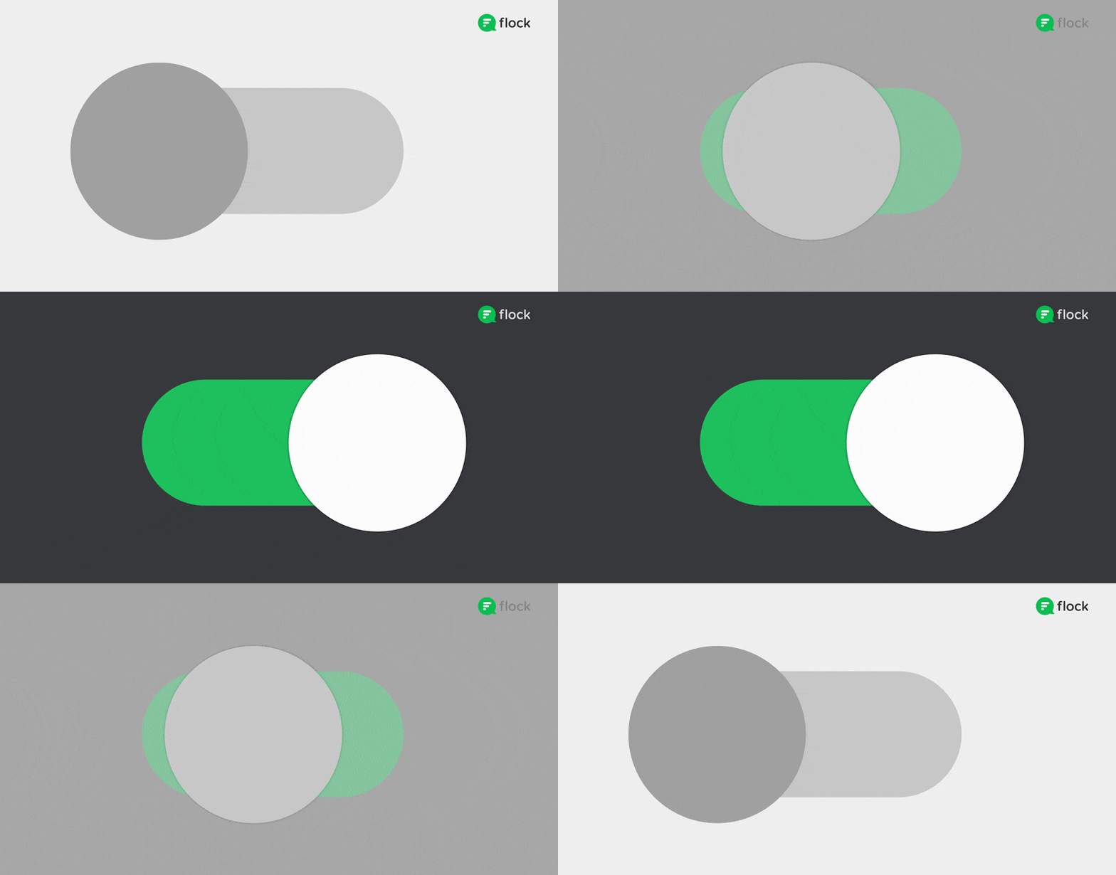
If like us, your most productive hours are when the lights are turned down, we’ve got some exciting news.
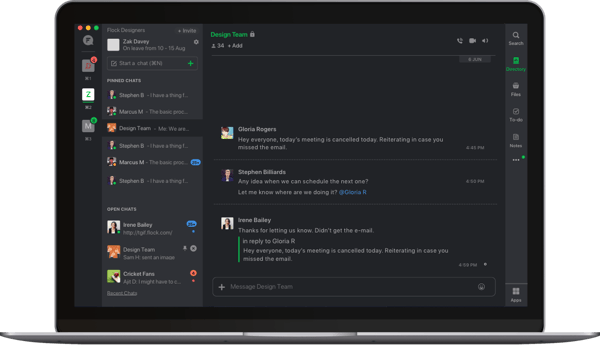
You can now switch Flock to a sleeker, darker look that works across Windows, macOS, Linux, and the web app! And, as of August 2020, dark theme is available for Flock mobile on Android and iOS.
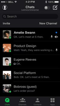 A top request from our users, Flock’s new dark theme makes it so much easier to focus on what really matters—your conversations.
We tested dozens of shades to create the perfect color palette for the dark theme. This involved simplifying our existing UI colors to 10 specific shades that cover all elements and interactions in Flock. We also refined all iconography and illustrations to work well with both light and dark backgrounds.
The outcome is a beautiful new Flock experience that is easy on the eyes, even more so in low-light conditions. It also helps extend your device’s battery life (OLED displays).
Switching to the dark theme is easy!
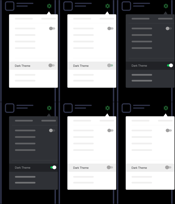 Simply expand the Settings menu and toggle the dark theme on. 🌚
Have questions about Flock's new dark theme? Your feedback can help us make it better.
Not a fan of dark colors? Relax, you can continue to use the default ‘light’ theme as always, now with improved contrast to enhance readability.
Finally, all these changes mean that we can create more themes for Flock faster than ever, so the new dark theme is just the beginning.
Love it? Have ideas for new themes? Let us know! :)


